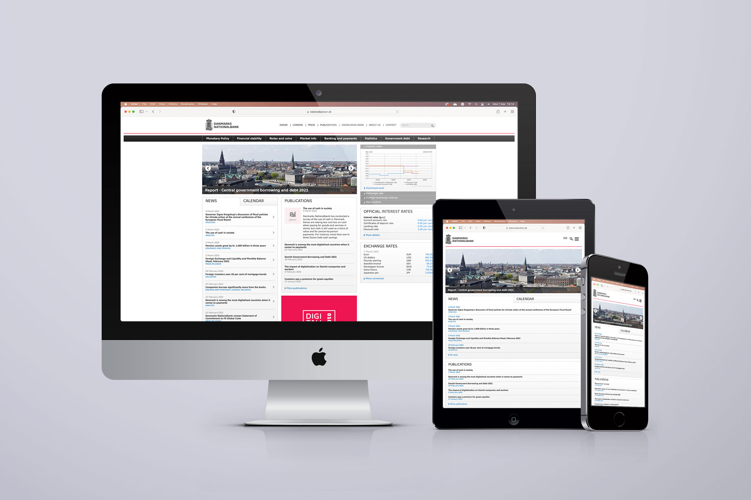
Danmarks Nationalbank
When Nationalbanken wanted to revitalize its visual identity, Tor Slotmann Studio helped identify and bridge the gap between the bank’s image, aspirations, and responsibilities and its visual identity.
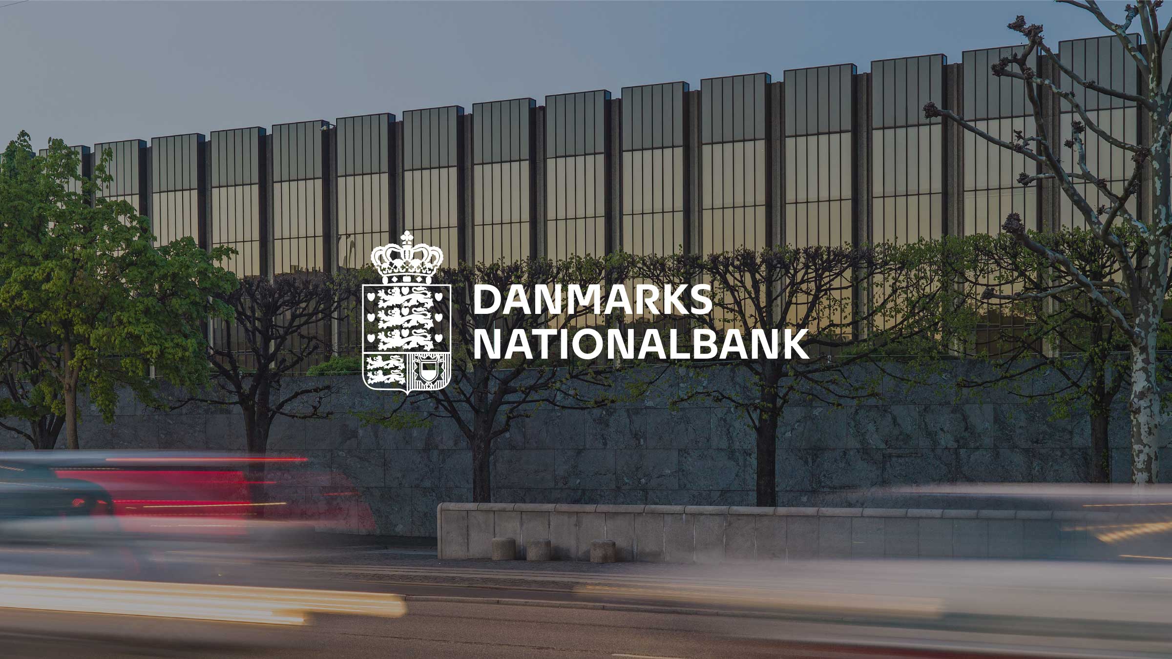
Danmarks Nationalbank plays a unique role in the economy of Danish society. Tor Slotmann Studio established a look to reflect the uniqueness using colors, photo style, and a bespoke typeface.
The visual identity also must communicate that Denmark’s central bank is the bank of banks on par with the other European central banks. So, the visual identity also had to convey similarities with these.
Our work for Nationalbanken aimed to get the balance right between having a unique identity and being recognized as a central bank.


Typeface
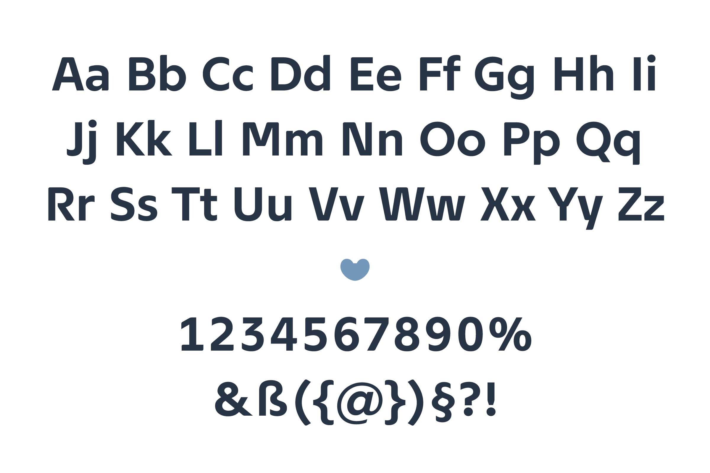
Designing and using a custom font inspired by the iconic Nationalbank Building by famous architect Arne Jacobsen made perfect sense as the building blocks of the visual identity.
We based the Nationalbank typeface on details from Arne Jacobsen’s iconic design and architecture for the bank and Danish typographic tradition.
The typeface is designed to be exceptionally readable in small sizes and reveals exciting details at larger point sizes. Also, we gave specific attention to the clarity of numbers, designed to work optimally in preparing accounts.
In addition, the aim is to give the font a contemporary look that suits a modern central bank.

